
Almost every time I try to visualize a data set, I end up with a chart that is totally different from the one I started with. The process of selecting a chart is mostly holistic to many people. This article offers a systematic way to choose a chart for effective data presentation.
Part of the problem is having too many complex charts; it is like staring at a menu with hundreds of dishes with fancy names, but you remain undecided about what to eat and which is the best choice for your body and health.
Cole Nussbaumer Knaflic, the author of Storytelling With Data: A Data Visualization Guide for Business Professionals, approaches this confusion with three questions: Who? What? and How?
- Who is the audience?
- What are you going to tell?
- How are you going to approach that?
Charts Types and Uses
A starting point is to understand two things clearly:
- What are you trying to tell people?
- Can your data convey the point?
The first question comes from an understanding of the problem, or "Why is a presentation necessary?" For instance, the intent of a presenter may be to tell an audience that increasing the break time by 20 minutes could have an increase in productivity of 20%. Although he/she may have reached this conclusion from the data available, or it was made known to the presenter by someone else, can it be proven with the data?
Which chart will be selected? This depends on the ability of a presenter to convey the concept that increasing one variable affects the other. In other words, explaining a correlation between two sets of data points.
A guide to chart types and their purposes follows.
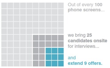
Simple text. Sometimes findings can be communicated with text only, simple as that. If communicating one to two figures or one comparative fact, text is the best choice (Fig. 1).
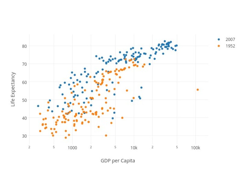
Points. Excel gurus will recognize this as a scatterplot. Use this plot to show the relation between two variables. (Hint: A third dimension can be added by using colors/shapes on the points). The chart below shows the relation between life expectancy and GDP; a third variable (year) was added as a color (Fig. 2).
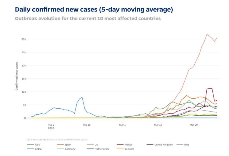
Lines. The purpose is somewhat overlapping with a Points chart described above. However, the lines chart is preferred to show a trend and compare the behavior of more than one series. Fig. 3 shows a historical view of the COVID-19 confirmed cases for different countries.
Slope graph (multiple categories and two time periods). This chart type is used, for example, when data are available for two consecutive months and the intent is to determine how these variables behave together in time (Fig. 4).
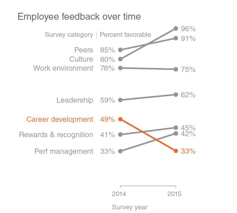
Another trick is to display the data of interest in a color different from the other sets. In Fig. 4, orange was used to highlight the data of interest.
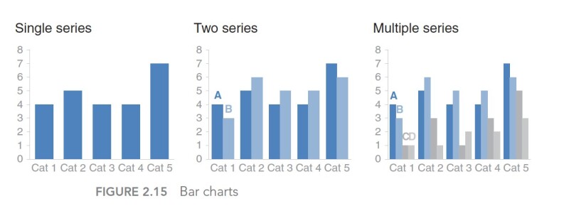
Bar chart. Its greatest advantage is that is easier to read than a line chart. Adding color coding to the bars allows for the presentation of more data without clutter. Series can be added as clustered bars or stacked colors. Check the example below from SWD. (Hint: Use horizontal charts to facilitate the comparison.)
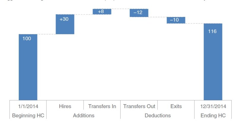
Waterfall. A type of bar chart, it is useful for showing how a variable changes over time (remains unchanged, increases, or decreases). Fig. 6 is an example.
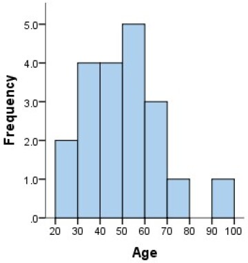
Histogram. Similar to bar charts, histograms group numeric values into ranges on the x-axis and the frequency of that specific range on the y-axis. Histograms are important in exploratory data analysis to determine the data distribution, mean, outliers, and the spread of the data around the mean (Fig. 7).
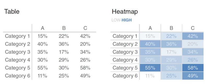
Table/graphical table (heatmap). Tables are effective in presenting mixes of data to a diverse audience. Although not generally recommended for live presentations, color coding used to direct the focus on the graph limits is encouraged to reduce the time spent by an audience to interpret the entire table. Comparing the same table in both examples in Fig. 8, the table on the right quickly focuses on the variables of interest without wasting the audience’s time. of the audience.
Area. Humans are not proficient in interpreting areas and converting them to quantitative measures, which may explain the confusion sometimes encountered with the segments shown in pie charts. To explain the ratio of a subgroup to a bigger one, use an enhanced version of the area chart.
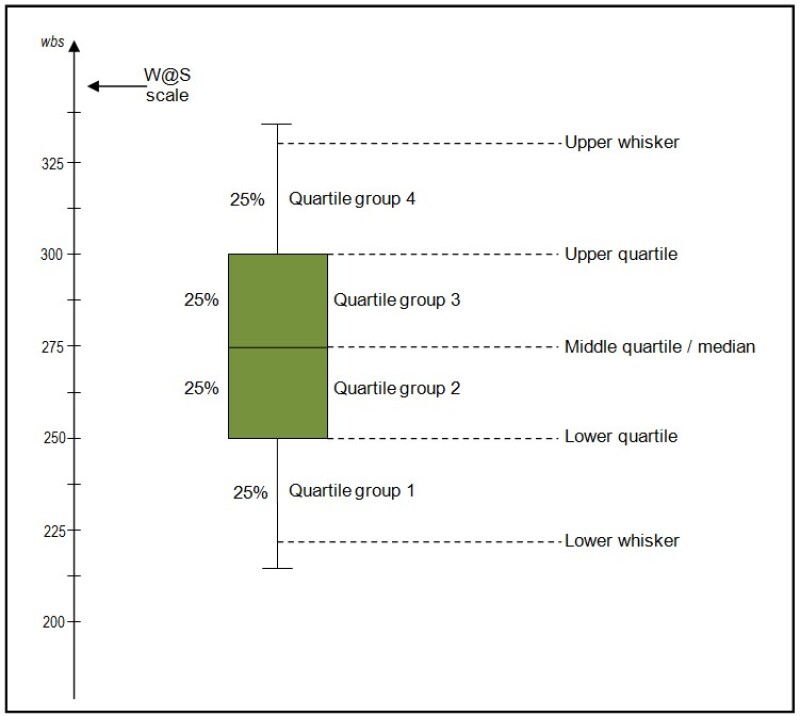
Box plots. To display the statistics of data beyond trends, box plots enable the addition of other variables for comparison of the data ranges, means, quantiles, and outliers (Fig. 10).
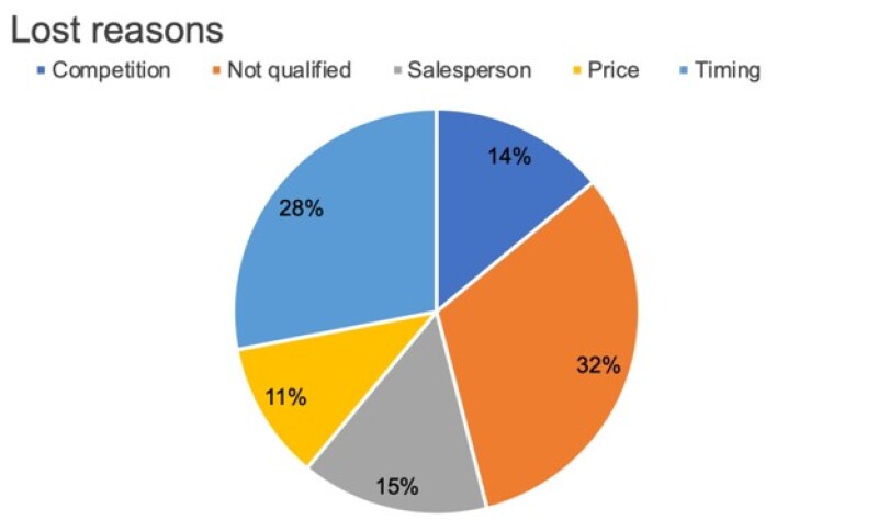
Pie chart. Pie charts show the relative numeric proportions for different categories in one data set (Fig. 11). The two main shapes are a solid version and a hollowed or donut-shaped chart (called a donut chart). Although pie charts are used widely in data visualization, experts do not recommend using pie charts in representing proportions because people generally have difficulty interpreting the areas and converting them to quantitative measures.
Selecting a chart is not an easy task and should not be treated as such. No matter how strong the findings are, a failure to tell the story with charts chosen for the data leads to a confused and uninterested audience. When preparing for a presentation, produce more than one chart from the data and ask coworkers for their first impressions. Always follow good practices and make the process in a create/feedback/modify style.
References and Resources
Storytelling with Data: A Data Visualization Guide for Business Professionals by Cole Nussbaumer Knaflic
Storytelling with Data: Let's Practice by Cole Nussbaumer Knaflic
Data Visualization: A Handbook for Data-Driven Design by Andy Kirk
Now You See It: Simple Visualization Techniques for Quantitative Analysis by Stephen Few
“Death to Pie Charts” by Cole Nussbaumer Knaflic. http://www.storytellingwithdata.com/blog/2011/07/death-to-pie-charts).
Websites (for visual enrichment)
- http://www.storytellingwithdata.com/blog
- https://flowingdata.com/tag/new-york-times/
- https://www.visualisingdata.com/
- https://junkcharts.typepad.com/
- https://www.economist.com/graphic-detail/
- https://www.census.gov/dataviz/
- https://www.tableau.com/about/blog
- https://www.visualcinnamon.com/
Twitter accounts to follow
- @visualisingdata
- @storywithdata
- @jburnmurdoch
Free tools to create data visualizations
- Tableau Public
- Microsoft PowerBI
- Google Data Studio
- Openheatmap.com
- Leaflet.com
- datawrapper.de
