
Imagine a science textbook without images—no charts, no graphs, no illustrations or diagrams with arrows and labels. The science would be a lot harder to understand.
That’s because humans are visual creatures by nature. People absorb information in graphic form that would elude them in words. Images are effective for all kinds of storytelling, especially when the story is complicated, as it so often is with science. Scientific visuals can be essential for analyzing data, communicating experimental results, and even for making surprising discoveries.
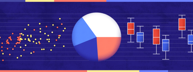
Visualizations can reveal patterns, trends, and connections in data that are difficult or impossible to find any other way, said Bang Wong, creative director of MIT’s Broad Institute. “Plotting the data allows us to see the underlying structure of the data that you wouldn’t otherwise see if you’re looking at a table.”
And, yet, few scientists take the same amount of care with visuals as they do with generating data or writing about it. The graphs and diagrams that accompany most scientific publications tend to be the last things researchers do, said data visualization scientist Seán O’Donoghue. “Visualization is seen as really just kind of an icing on the cake.”
As a result, science is littered with poor data visualizations that confound readers and can even mislead the scientists who make them. Deficient data visuals can reduce the quality and impede the progress of scientific research. And, with more and more scientific images making their way into the news and onto social media—illustrating everything from climate change to disease outbreaks—the potential is high for bad visuals to impair public understanding of science.
The problem has become more acute with the ever-increasing amount and complexity of scientific data. Visualization of those data—to understand as well as to share them—is more important than ever. Yet scientists receive very little visualization training. “The community hasn’t by and large recognized that this is something that really is needed,” said O’Donoghue, of the University of New South Wales and lead author of a paper about biomedical data visualization in the 2018 Annual Review of Biomedical Data Science.
There are signs of progress, however. At least two annual conferences dedicated to scientific data visualization have sprung up in the last decade. And the journal Nature Methods ran a regular column from 2010 to 2016 about creating better figures and graphs, which was then adapted into guidelines for scientists submitting papers to that journal. But, so far, few scientists are focusing on the problem.
Improving scientific visualization will require better understanding of the strengths, weaknesses, and biases of how the human brain perceives the world. Fortunately, research has begun to reveal how people read, and misread, different kinds of visualizations and which types of charts are most effective and easiest to decipher. Applying that knowledge should lead to better visual communication of science.
“We have a lot of practical knowledge about what works and what doesn’t,” said computer scientist Miriah Meyer of the University of Utah. “There are a lot of principles that have been through the test of time and have been shown over and over again to be really effective.”